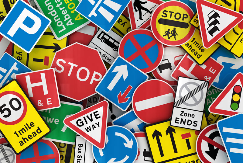
Navigating my way around a new campus, library and life in general, I’ve noticed something that’s relevant to clinic life, too – signs: sometimes helpful, sometimes not so. I thought I’d have a read around about the good, the bad and the SHOUTY!
There is an exact science to how we read signs and absorb information, and it’s a delicate balance of text, visuals and colours – as well as keeping the total number of signs to a minimum.
Too often, we assume BLOCK CAPITALS are the way to get attention, or red letters highlight important information, and that the more signs, the more people will realise you are trying to share important information. This is particularly acute in some areas of the veterinary clinic, where the only space to put signs may be on cupboard doors.
Might the information you need actually be on the outside of the cupboard that you’re looking into to find what you need? Is there a critical number of signs, and a “best practice” way to present information?
ARE YOU SHOUTING?
It can be assumed that important signs need to be over the top, yet some of our daily use of signs that are important are very subtle. Road signs have an interesting history and can make you realise that BLOCK capitals or bright colours aren’t necessarily needed.
The creation of the motorway network in the UK brought in a need for a standardised system of signs that could be used everywhere. Suddenly, lots of traffic travelling at 70mph on new roads needed to be able to read reasonable amounts of information to get it to its destination, but also not distract drivers from watching the road conditions around them.
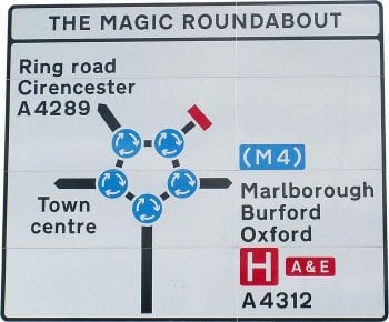
An interesting conundrum, and one that I think I can align with locuming, as you need to keep moving at the same pace as the team, but find all you need in a new space. Sometimes it feels like navigating the magic roundabout at 90 mph.
 As I’ve written before about trying to find a green needle, good signage is the make or break for us locums or new starters.
The research into UK road signs and why they are successful has been reviewed by many people, but the start of the process came out of the confusing multiple styles of road signs of the 1950s. A new system for Transport and Motorway signs that involved the development of new typefaces (fonts) were developed. It was noted that the use of CAPITAL letters made words harder to read from a distance and the shape of letters and the use of upper and lower case helped give the words “shape” that helped with identifying them.
Also, in our internet age, we know that netiquette describes block capitals as SHOUTING – but you may not be heard!
Location, location, location
Where you put your signs is important, as you are required to display certain signs or documents by law, so check out the information here – it has great advice on where to put signs to avoid confusion and prevent important information being overlooked. It will also help you decide if your sign is a permanent fixture or a temporary one.
How many is too many?
It’s worth checking out the guidance about health and safety signage – does every hazard need a sign?
Too many signs provides information overload, so think carefully about what you NEED as well as just what you’d LIKE to share.
Keep it simple
The designers of these road signs recognised that their work was a success if the actual work put into it wasn’t noticed – “you know you have done well when no-one comments on it”.
This mantra could help us in the veterinary clinic, as we often pile more signs on top of others. Sometimes, we’re too afraid to undo someone else’s work or to remove a “vital” piece of information, even if you think its old or unnecessary.
Reviewing your signage as a team could help keep it simple. I’ve worked in clinics where the signage includes instructions for a machine that is no longer in use or gives the phone numbers of staff no longer in that clinic. None of this was useful, but it still needed to be read to then discard that information – not the best use of time.
From the reading I’ve done, it seems “less is more” on the signage front, so before you warm up the laminator to create another masterpiece, think if you NEED or WANT that new sign, and does anyone else actually read them?

Leave a Reply