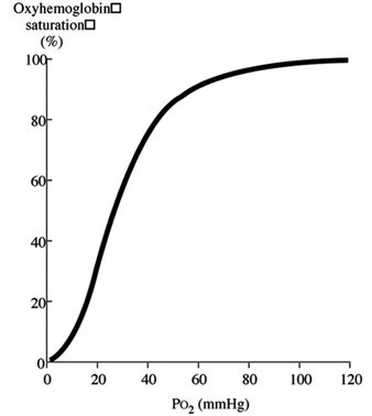
The oxyhaemoglobin dissociation curve (OHDC) is a graphical description of the relationship between the partial pressure of oxygen (PO2; x-axis) and the oxygen saturation (y-axis).
To make sense of this graph, we need to first understand the reasons that drive oxygen movement between the haemoglobin (Hgb) and the body tissue.
Oxygen binding affinity
The major determinant of oxygen binding to the Hgb is the PO2, which the Hgb is exposed to. When the PO2 is high – typically in the lungs at the alveolar-capillary interface, oxygen readily binds to Hgb because of its increased affinity to oxygen.
The opposite occurs in other body tissues, where the PO2 is less. This reduces the Hgb’s ability to maintain its binding capacity of oxygen (reduces affinity) and oxygen is released into the tissue instead.
Looking at the OHDC, it can be seen the relationship between the arterial PO2 (PaO2) and peripheral oxygen saturation (SpO2) is not linear, and this has to do with the Hgb’s changing affinity to oxygen.
 Initially, when the first oxygen molecule binds to Hgb’s, a change occurs in its conformation that increases its affinity for subsequent molecules of oxygen and, thus, hasten binding. This is depicted by the steep part of the OHDC curve.
However, as more oxygen binds, the available binding sites become saturated and further increase in PaO2 doesn’t increase further additional binding. This is the flat portion of the curve where the SpO2 doesn’t increase very much, despite a constant increase in PaO2.
The only way to further increase SpO2 is by increasing the haemoglobin content (blood transfusion) and, thus, the total oxygen carrying capacity of Hgb. This is important to factor in when treating anaemic patients, where any further increase in oxygen delivery is unlikely to benefit the overall oxygen capacity of the patient.
Patient application
So, we now understand the oxygen binding affinity to the haemoglobin, but how can that be applied to the patient as a whole?
The curve is actually a graphical representation of the movement of oxygen around different parts of the body. The flat, upper portion of the curve represents the lung/alveolar interface when PO2 is usually high. In this region, the Hgb’s affinity for the oxygen is high, so very little change occurs in the SpO2 in a range of PO2 (80mmHG to 100mmHg).
This is an important defence mechanism of the body that ensures the loading of oxygen on to Hgb is unaffected in the face of varying PO2. Once PaO2 decreases beyond 80mmHg, though, a more rapid decrease occurs in SpO2 for a given decrease in PaO2. This is the middle, steep, lower portion of the curve. This part of the curve describes the peripheral tissues where the PO2 is much lower compared to that of the lung/alveolar interface.
Hgb’s affinity for oxygen decreases as PO2 decreases – this is why a small decrease in PO2 in this range will result in a significant reduction in SpO2. This is very important as it means peripheral tissue can withdraw large amount of oxygen for a small drop in PO2, promoting oxygen diffusion into the tissue.
The norm for peripheral tissue is 40mmHg PaO2. If you look at the graph closely, it will be equivalent to approximately 75% SpO2. This means the tissue has been able to extract 25% of oxygen and the Hgb is left with 75% of its oxygen-carrying capacity.
Key to understanding
This is the graph for a typical, healthy individual. Understanding this will help make sense of what actually happens in diseased patients, or patients with physiological changes, that shifts the curve of this graph.
By understanding the changes that occur, it is only then you can implement effective management strategies to help these patients.

Leave a Reply